ASN members needed

do you like the new black look ?

  • yes

    Votes: 54 49.5%
  • No

    Votes: 55 50.5%
  • never noticed

    Votes: 0 0.0%

  • Total voters
    109
  • Poll closed .
i still prefer the old one... from what i remember haha,
couldnt it be possible to be able to load up which skin you like? was a member of an alfa forum and u could choose between 3 or 4 from what i remember?
 
the issues brought up will be forwarded to Rob and Adam so they can implement them....hopefully.
 
I'm all for user choice. Can we have user defined "skins" please. That way everyone will be happy.
 
Black is good..Black reflects the futrure..Black is the new White but in like a darker way man...:rock:
 
Sorry do not like it at all , i thought it was temporary ..

But if this is now the resident theme , i have to say NO
 
I quite like the black. It looks more modern and isn't that bad to read once I got used to.

However, as others have mentioned there are some further cosmetics that can help improve the user experience but nothing which isn't a simple tweak. I don't see any issues with layouts like other but am generally on IE8 or Firefox.

If I was to prioritise my list of issues it would be:
1) Cannot tell what is a new post easily
2) Cannot see the start of someone's signature easily
3) White pixels on smileys
4) Cannot see the user online status easily

Again, all cosemtic. The site seems faster to me and I haven't seen any performance issues.

Seeing the number of users that are asking for a theme choice it may not be a bad idea time/developement resource availability permitted.

Thanks
Pii
 
I preferred the site lighter in colour. ASN now reminds me of one of those spyware/virus laced website where you find hacks for trial software.

Bright websites are always a nicer place to be, IMO. Just have a look at most of the "big" sites. Almost all bright, and I bet that ain't by coincidence.
 
I thought I liked the black theme at first, but found over time I'm straining more to read and like others have already stayed, it's harder to notice new posts as the colouring doesn't stand out. A selection of themes would be perfect... In an ideal world ofc.

I still think you guys are doing a great job, so keep it up fellas. This site still seems heaps better than others I hve been a member of before.
 
What do you think of the new black themed site ?

Afraid I prefer the old colours. It seems to be hit and miss whether a page load properly now and I do not find the current theme very easy on the eyes.

Keep up the good work though mods, ASN is a great resource.
 
I just voted Yes, probably the first change to AS.net I have liked...

I havent had any problems (using Firefox), only thing thats annoyed me is some of the coloured text (such as where it says Vorhees in blue next to your Avatar) doesnt seem very sharp and looks a bit blurry, same with the posts done in purple text.

Other than that its great, dont have any problems reading threads or seeing new posts.

Keep up the good work! :)
 
Its wicked in FF, but on IE on my lappy, it's quite sqwonky looking.

If maybe we can make some alternative skins for those that want a lighter colour, and maybe a "lite" scheme once some of the sompatabilities with IE are ironed out, Win Win for everyone.

If i can help i will

Unkle....WOW !!
 
If maybe we can make some alternative skins for those that want a lighter colour, and maybe a "lite" scheme once some of the sompatabilities with IE are ironed out, Win Win for everyone.

I'd like that, a lot. :beerchug:
 
Last edited:
The old index in case anyone forgot:

OldASN.png
 
Seeing what Staz has put up I still agree the new look is best. You guys are working hard to please everyone and that will never happen. This site looks so good apart from a couple of minor tweeks! Good work.
 
The old index in case anyone forgot:

OldASN.png

To be honest I don't even remember it looking like that. Wasn't there a more greyie blackie redie one??
Feels like it's been changed so much recently that I've forgotten which one it is I liked!

But if it is a choice between the current colours and the one that staz posted.... then I guess I prefer the current.
 
This one ?
24thsept-2.jpg


or even further back :thumbsup:

untitled-17.jpg
 
:lmfao:
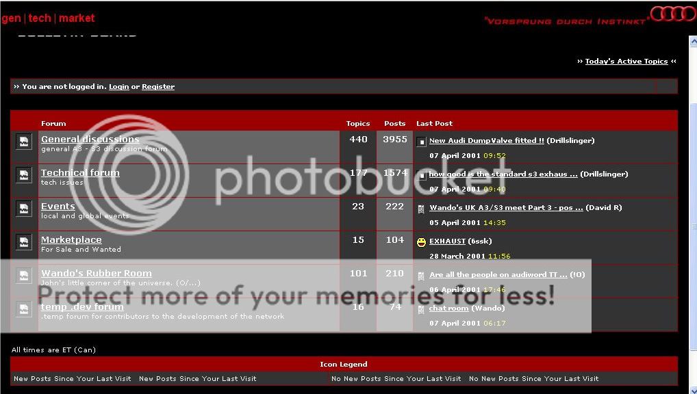
I still prefer this new one but the 'even further back' one was good too! Looks better dark than light!